티스토리 뷰
[Mobile]LG Wing hands-on Review Gallery
가지가지하는 부부 - do variety 2020. 10. 12. 18:47LG Wing LG Mobile
We are going to proceed with a brief review of Wing, which was officially released in early October 2020. I think the review order is as follows and I don't know when it will be completed.
1. Exterior : https://blog.naver.com/g82net/222108775507
[모바일][LG]LG Wing 리뷰 (외관)
https://image5.lge.co.kr/uploads/product/media/2020/09/lmf100n.asktik/usp_0103_3.jpg LG Wing ...
blog.naver.com
2. Gallery : https://blog.naver.com/g82net/222110670096
[모바일][LG]LG Wing 리뷰 (Gallery - 갤러리)
LG Wing LG Mobile2020년 10월 초 정식 출시한 Wing의 간단한 리뷰를 진행하려고 합니다. 리뷰 순서...
blog.naver.com
3. Camera
4. Etc
Review 2.
LG Wing Gallery
Normal phone UX - Swivel UX
01 Phone Type
I don't seem to do any gallery reviews. The iPhone Photos app and Google Photos app have a similar UI for a long time, so there is not much new feeling, but I think that in the case of domestic manufacturers LG/Samsung, there are always many attempts and new challenges.
Defaul Layout LG UX9.0

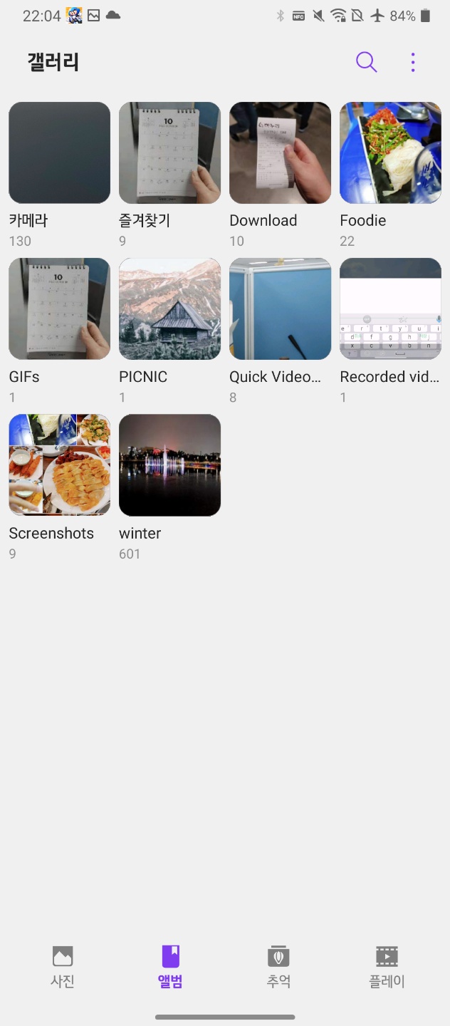

Photo-Album-Memories-Play (Video) tab order
The default layout is provided in the order of photo-album-memory-play, as shown in the photo above. When you first enter, you can view photos-all photos in chronological order-you can view the whole, and Mondrian layout is provided in three columns.
iPhone : Photo - For You(Memories) - Album - Search
Google Photo : Photo - Search - Library
Various layouts are provided according to the number of photos, but basically, since it was backed up and restored from the previous phone, you can feel a rich and emotional feeling well.
사진 탭 Photo Tab


In the case of the photo tab, 3-4-5-6 columns are provided, and after that, it is switched to the month screen (Monthly)-the open screen (Yearly), so you can check the overall image feeling. (It's not easy to feel it for search or appreciation purposes)
앨범 탭 Album Tab


You can view folders such as Camera, Favorites, Downloads, Camera App Folder, GIFs, Quick Video Editor (Save path after video editing), Recorded videos (Save path after screen recording), and Screenshots. (There are not many folders because it has not been backed up-restored) In addition, it provides options to switch to camera, share, select, select sorting, slide show, make video, make GIF, make collage, add signature, view locked files, and trash can.
추억 탭 Memories

It is not at first, but after time passes, images/videos that are automatically related to the Memories Album tab are grouped by logic and provided as a slide show. (It is extracted as a separate video.) A lot of memories were created in the album on other phones.
한 장 보기 Detail

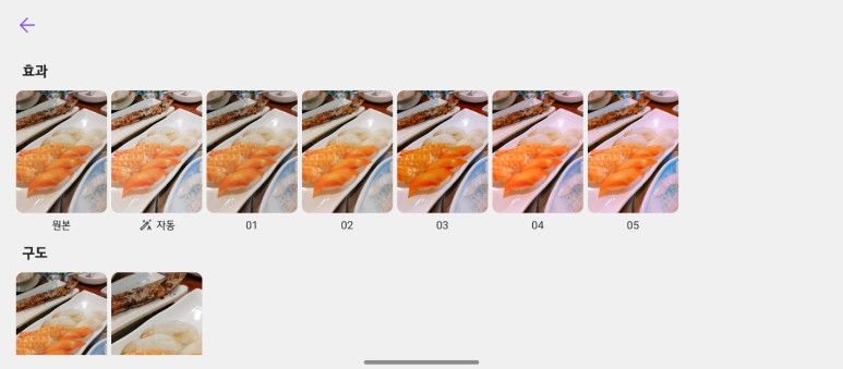
Swipe up in single view to see different effects.
If you go into the one-page view, it basically provides photos and a thumbnail list at the bottom, but it was easy to search for photos quickly while flicking. Also, when you lift the screen from the single page view, various effects are automatically applied and shown.
The effect is an image that automatically corrects the original and optimal image, and provides a filter effect appropriate to the scene of the image.
Composition has a function that recommends the optimum composition for the original image. Especially in the case of a person, it is quite useful to cut it around the person and recommend it.

콜라주 만들기 Collage

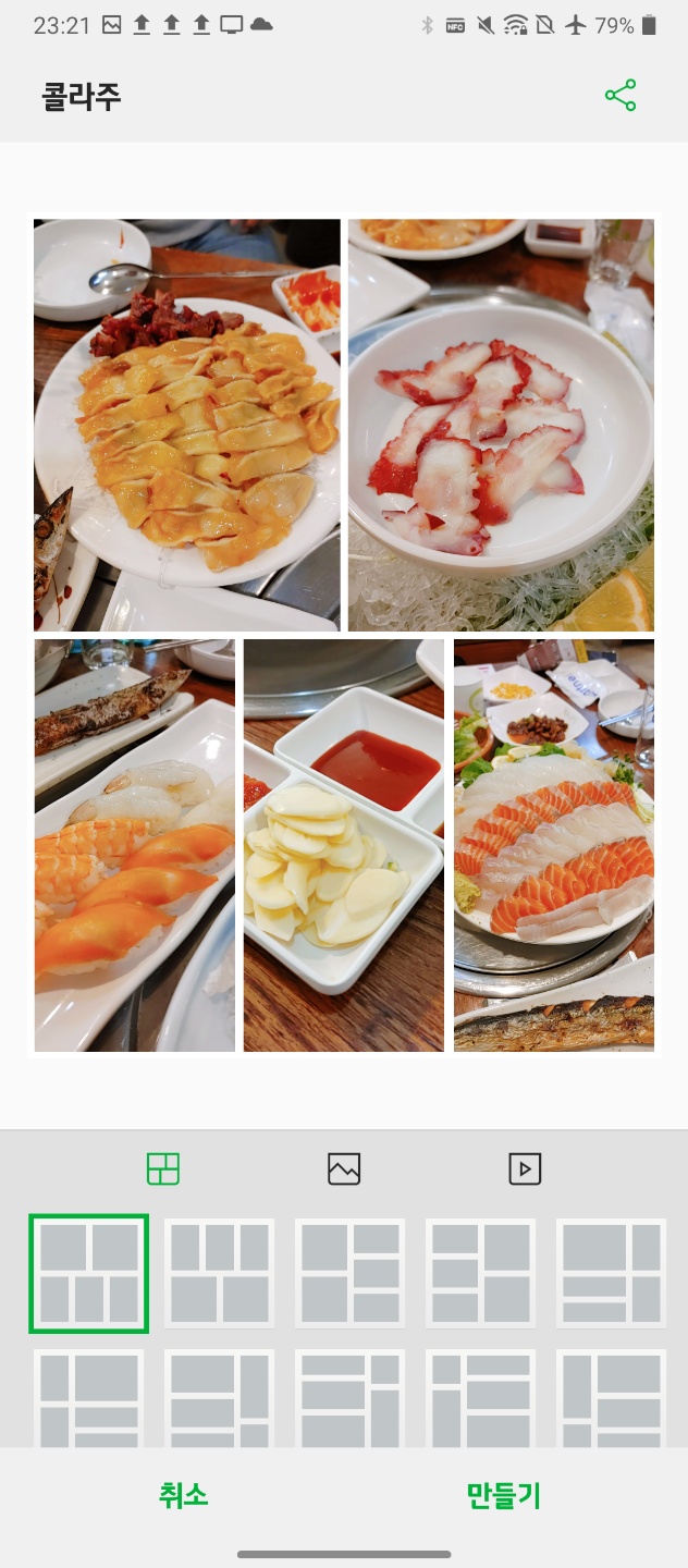

Various frames are provided depending on the number of photos.
It's a feature that you can easily see in the Market app, but Collage allows you to create a funny image by selecting a photo you want and checking various frames. Google Photos automatically created it and even recommended it.
02 Swivel Type
Now, let's take a quick look at the Swivel UX, which is a special feature of Wing.


The picture above is the screen when the gallery is individually run from the top/bottom. Depending on the appropriate scene, it will be effective to run and enjoy it wherever you want.
한 장보기 확장 Expand

It can be expanded from the top to one page view through the button on the right of the bottom screen.
스위블 확장 화면 Swivel Expand

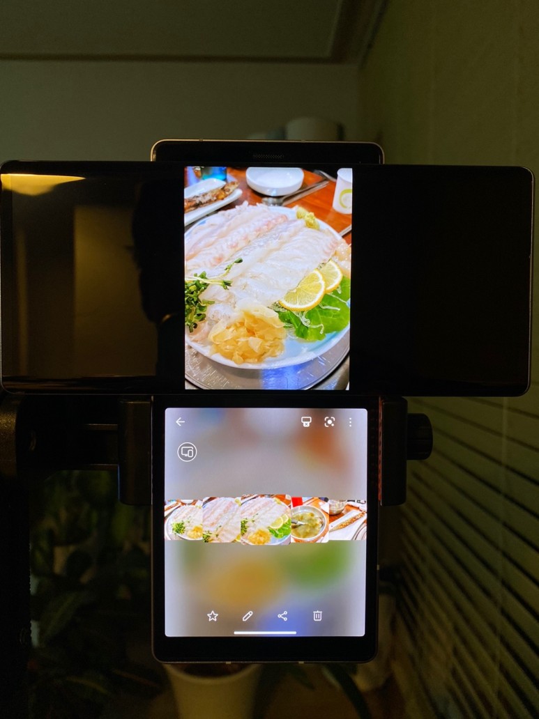
It is divided into the original image on the upper display and the carousel view on the lower screen (thumbnail list), so you can feel the original image without covering your hand. As far as I know, using full screen is possible in Camera/Gallery/Video and I know that some third party apps provide it.
스위블 동영상 화면 Swivel Video Player
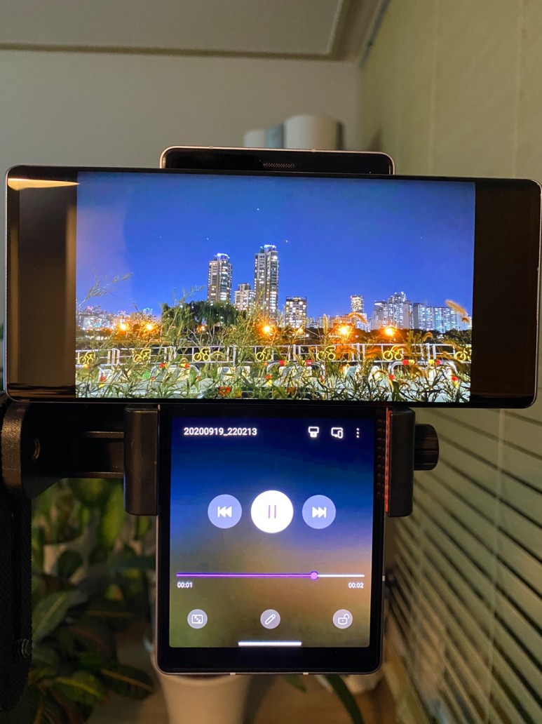
I think watching videos is one of the main scenes, but the ability to play videos on the top screen and control directly from the bottom is attractive, and the function of using other apps through multitasking is perfect for the phone concept. I think it is.
동영상 편집기 Quick Video Editor

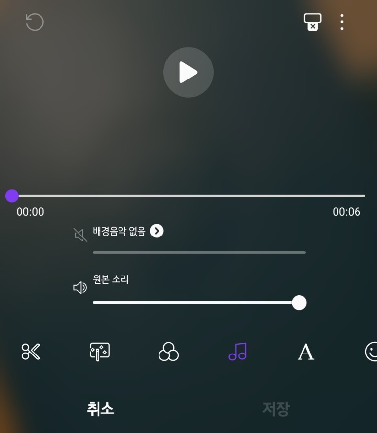

Various functions such as trim, filter, theme, text, icon, speed, ratio setting, etc. can be used through the lower screen
LG's quick video editor also felt that it fits well with the form factor concept of the LG Wing wing, and it was one of the very convenient features because you can control it right from the bottom while watching the edited version largely from the top. (It is judged that it is the best among the wing functions) BG is also blurred, revealing a lot of emotional feeling, and I felt that I put a lot of effort into it.
So far, we have briefly reviewed (but took a long time) the LG Wing Wing's gallery, video, and video editor features. The basic UX is great, but I think you'll know the convenience of swiveling once you try it.
Next, let's take a closer look at the camera and other functions.
'IT-Tech > LG Electronics' 카테고리의 다른 글
| [LG][Mobile]LG WING, gaining popularity ahead of full-scale launch in the US (0) | 2020.10.16 |
|---|---|
| [Mobile]LG Wing hands-on Review (Exterior) (0) | 2020.10.12 |
| [MobileReview][LG]LG Q92 (0) | 2020.10.10 |
